NFL Teams

Philadelphia Eagles Logo History: Timeline and Designs

By Sushan Shrestha / 12 December 2023 02:06 AM

( Source : facebook )

Since their inception in 1933, the Philadelphia Eagles have soared through the NFL, leaving their mark on the field as well as on the sports branding. From 1933's blue-clad eagle to today's sleek green and silver symbol, each design reflects the team's evolving identity.

In 1936, green took center stage, a color that would become synonymous with the Eagles. It evolved from aggressive talons clutching a football to a softened stance where the addition of white added a much-needed contrast.

The famous helmet emblem shifted the entire agenda towards simplicity in the 1970s. But, the fans hoped for the return of classic trend and the franchise answered the prayers in 1987 with the return of the vintage eagle. The inclusion of brown and orange made the emblem appear more dynamic than its predecessors.

The current logo, introduced in 1996, retains the essence of its predecessor while streamlining the design. The focused gaze of the eagle reflects the team's unwavering spirit, symbolizing years of Philadelphia football pride.

The Original Fierce Blue Eagle: 1933-1935

( Source : sportslogohistory )

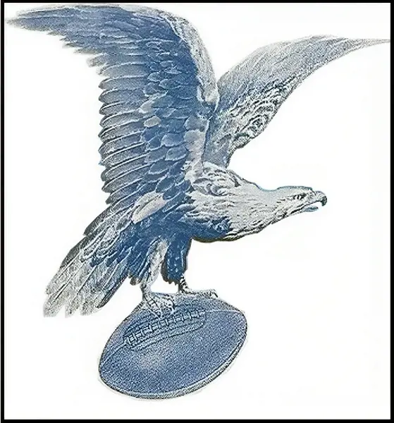
The Philadelphia Eagles' logo during its initial three years (1933-1935) stood out from its later iterations due to its unique color palette. Instead of the now-familiar green, they proudly displayed a fierce blue eagle.

The Eagles were inspired by the National Recovery Administration's blue eagle logo. The NRA was the foundation for President Franklin D. Roosevelt's New Deal policies. Amidst a faltering economy, this relationship embodied the idealism and optimism that enveloped the Eagles' formative years.

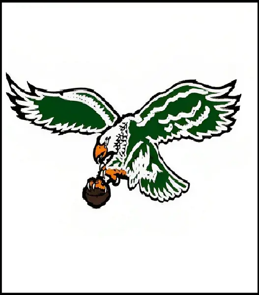
This intricate artwork showed an eagle with its claws holding a football, its wings fanned out, and an unwavering expression on its face. The eagle's head and tail feathers were exquisitely highlighted by white accents, which also added contrast and intricacy to the design.

The short-lived motif marked the commencement of a long and storied journey, and its bold blue eagle remains a treasured element of the team's legacy.

( Source : sportslogohistory )

The Philadelphia Eagles emblem saw a drastic makeover in 1936, losing its blue feathers to reveal a striking new design. The Eagles' now-signature green took center stage, displacing the previous year's blue.

This move was a reflection of the team's intention to create a distinct brand, break free from their affiliation with the National Recovery Administration, and set themselves apart from other NFL clubs.

With the eagle holding a football in its claws, the 1936 logo kept the essential components of its forerunner. However the pose was more dynamic, and the design was more streamlined and straightforward. The team's youthful optimism was reflected in the green color, which exuded a feeling of fresh energy and vitality.

Likewise, the eagle's strong wings were highlighted by the addition of white, which also gave the design more depth. A less aggressive expression crept into the bird's stance. This evolution indicated how professional and mature the team was becoming.

The Steagles: 1943

( Source : sportslogohistory )

Due to World War II, player shortages hampered the Eagles. As a result, the team temporarily merged with the Pittsburgh Steelers in 1943, forming the "Steagles." A distinctive logo that integrated aspects of the identities of the two teams was produced as a result of this brief union.

The 1943 "Steagles" logo featured a hybrid eagle, with the wings of a Philadelphia Eagles' eagle and the body of a Pittsburgh Steelers eagle. The bird clutched some kind of helmet instead of a ball and the two teams' city names were displayed prominently beneath the emblem.

The Eagles and Steelers share a unique place in history, despite the logo's brief existence. It symbolizes a time of cooperation and selflessness, exhibiting the spirit of good sportsmanship and friendship through a trying time.

It serves as a reminder of the team's adaptability and proficiency to overcome challenges. The logo's bold eagle and vibrant green color continue to resonate with fans today, representing a unique chapter in the Eagles' journey.

Agressive Kelly Green Eagle: 1944-1947

( Source : sportslogohistory )

Designed in 1944, this version adopted a more elegant and refined design in place of the wartime eagle's combative stance.

Dominated by solid green, the 1944-1947 logo featured a simplified silhouette of an eagle in flight. The bird's wings extended upwards, conveying a sense of soaring ambition and freedom. The football, still clutched in its claws, remained a mark of the team's devotion to the sport.

The sharp edges and menacing expressions no longer existed. Instead, the bird had an optimistic gaze and appeared calm and composed.

The Eagles' past and present were connected by this logo. It offered a more modern and dynamic design while keeping the green hue that had come to represent the team.

Vertical Eagle With A Hint Of White: 1948-1968

( Source : twitter )

The Philadelphia franchise's logo entered a period of relative stability and sophistication between 1948 and 1968. Although the fundamental components of the design stayed mostly unaltered, minor adjustments improved the logo's visual appeal and modernity.

The familiar green eagle clutching a football continued to be the focal point. However, the wings underwent a slight redesign, featuring a more streamlined and dynamic appearance. Shading and feather details were added, creating a sense of depth and realism.

Similarly, the white accents provided a cleaner and more focused image and the softened sharp angles of previous iterations created a smoother flow and a sense of movement.

The Eagles had a stretch of comparatively good play during which the logo remained stable. Their status as one of the league's best was cemented in 1960 when they won their first NFL Championship against Vince Lombardi's Green Bay Packers (17-13).

Geometric Modern Eagle: 1969-1972

( Source : twitter )

There was a significant change in the Philadelphia Eagles' visual identity in 1969. The team's iconic green eagle, which had represented them for many years, was swapped out for a striking, contemporary design.

This choice, which symbolized a turning point in Eagles' history, followed the increasing trend in professional sports toward simpler, more instantly identifiable logos.

During this time, the emblem featured a sleek and stylized eagle, distinct from its predecessors. The forward-facing stance and crisp, dynamic lines perfectly captured the team's spirit by exuding strength, agility, and determination.

The Eagles' lofty goals on the football field are embodied by the bird's wide-open wings. The impact and visibility of the logo were increased by the use of a striking color scheme that featured bright whites and deep greens.

The 1969-1972 Philadelphia Eagles logo stands as a stamp of the team's commitment to progress, resilience, and a futuristic approach during an exciting period of change in both football and design aesthetics.

The Helmet Era: 1973-1986

( Source : twitter )

From 1973 to 1986, the Eagles' logo entered a minimalistic phase. This bold design saw the complete removal of the eagle, leaving only the team's iconic helmet as the visual representation.

This shift was a radical departure from the traditional logos of the past. The distinctive Kelly green helmet, devoid of any embellishments or logos, stood for protection and strength. The team's crest was replicated by the design of their helmet and the classic Eagles wings were positioned on the side in a sleek and contemporary design.

The clean lines and bold green color created a powerful and instantly recognizable image.

While initially met with mixed reactions, the helmet logo quickly grew among fans. The helmet grew to represent strong defense and a never-give-up attitude towards winning.

This 14-year period cemented the Eagles' helmet logo as a beloved symbol of the franchise. It demonstrated the team's willingness to embrace bold change and experiment with design.

The Return Of Traditional Bald Eagle: 1987-1995

( Source : twitter )

In 1987, the Philadelphia Eagles' logo took flight once again after a decade of featuring only the team's helmet. Eagles supporters were enthralled with this new version, which deftly combined retro components with a contemporary style.

The 1987-1995 logo featured a retro-style eagle holding a modernized version of football, a subtle nod to the team's early years. But the eagle's design wasn't just a replica. With its wide-open feathered wings and determined face, it assumed a more aggressive stance.

Though it was a welcome reappearance, the eagle's design was sleeker and more sophisticated than that of its forebears. With the addition of orange and brown to the standard green, the colors were more vivid and gave the design a bit more vitality.

This logo served as a reminder of the team's rich history and its unwavering spirit. While embracing elements of the past, the logo also incorporated modern design elements, ensuring its relevance in the contemporary sports landscape.

The Ferocious Eagle: 1996-Present

( Source : facebook )

Since 1996, the Philadelphia Eagles have sported a bold and iconic logo that has become synonymous with the team's identity.

The design features a regal, left-facing eagle's head, conveying a sense of power, determination, and unwavering focus. The sharp and bold lines create a dynamic and determined image, reflecting the birds' ambition and fighting spirit.

Meanwhile, the gradient white and gray tones add depth and dimension to the design, while the thick black outline and blue shadow provide definition and enhance its visual impact.

Since its introduction, the team has reached multiple Super Bowls and captured numerous division titles. The emblem has witnessed iconic moments in the Eagles' history, solidifying its place as a beloved symbol of the team and its passionate fanbase.

The Philadelphia Eagles logo, which has been in use since 1996, has served as the team's enduring emblem for more than 20 years. It serves as a visual depiction of the franchise's resiliency, development, and dedication to excellence.

Related post of NFL Teams